Hello friends!
It's me, Jelissa, with you on the 13@rts blog today. I have a layout and some tips to share with you, and I've tried to do a few different things after a friend challenged me to go out of my comfort zone.

So what I did differently was to use bright colors instead of my usual mixture of neutral and cool colors. I've used a neutral beige as my base (because it helps to balance your colors and lets your eyes rest from all the excitement), orange and salmon as my secondary colors, and yellow as an accent. This is a general rule I use to decide how much of each color I want to have on my project -
1) one main color (dominant color - beige)
2) 1 to 2 secondary colors (for movement and mood - orange, salmon)
3) 1 accent color (something to highlight and give it a pop - yellow)
And I use them usually in this proportion, with "Gallon" being the most and "Dollop" being the least:
"Gallon" (dominant color) -> "Quart" (secondary color 1) -> "Pint" (secondary color 2) ->
"Dollop" (accent color)
I also deliberately used a black and white photo to make the colors I have more outstanding, and I didn't count the black I used in my stamping and splatters as a color per se.

Most of my secondary colors are in the background elements, while my accent color is used in places to highlight my elements eg. photo mat to lead your eyes to the photo of my cute little boy and his long eye lashes, and the balancing cluster with the frame and the pale yellow chrysanthemum.
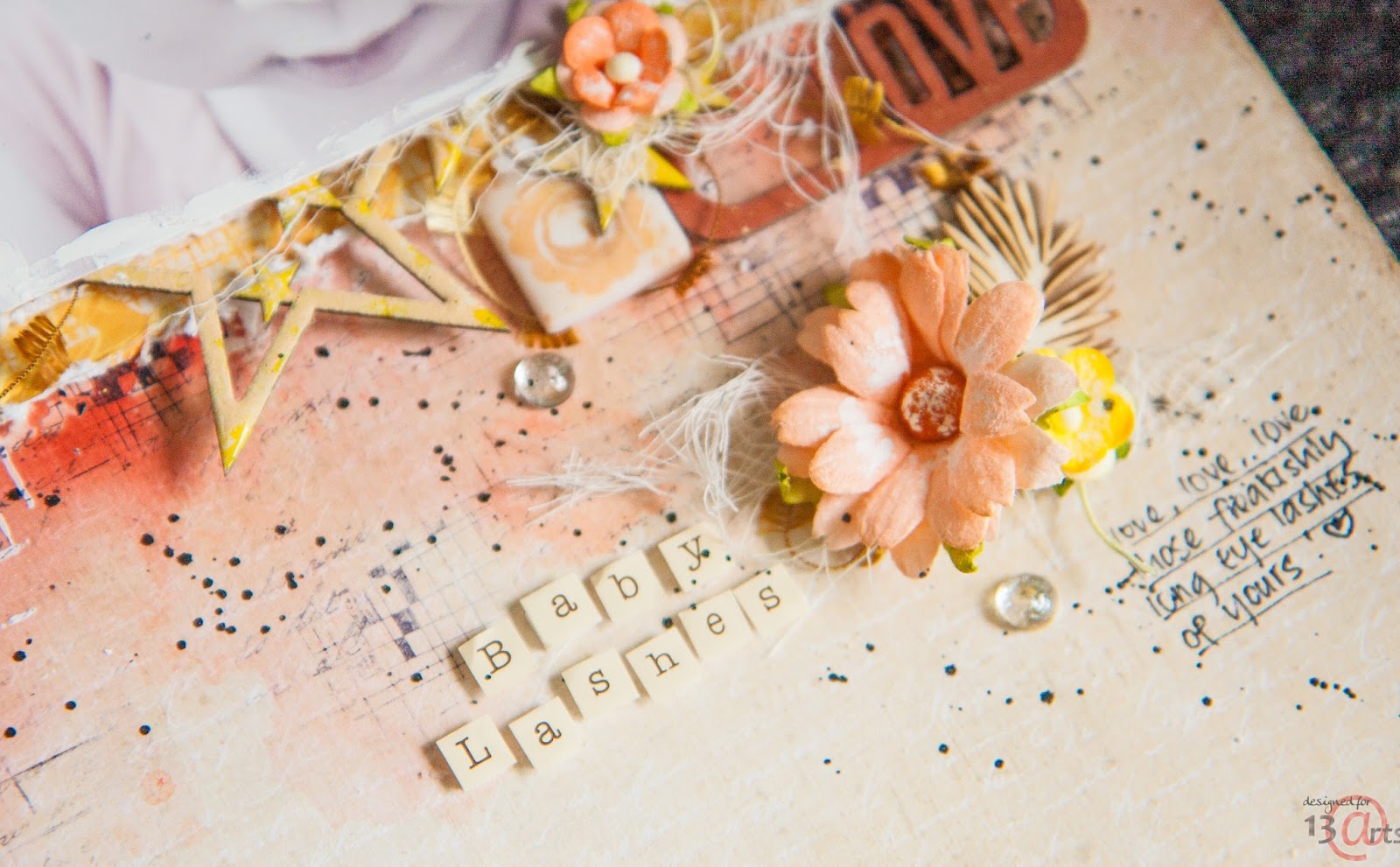
Another fun thing I tried out was using the Silver Glitter paint as an adhesive. I put small drops of it where I wanted my dew drops and put them on. The result is a beautiful glittery effect inside the plain looking dew drops.
So that's all I have for this month, hope you find the tips on using color useful!
13@rts products used:
Paper "Cinnamon / Black", Paper "Cinnamon / Black", Ayeeda Paint - Vivid Yellow, Ayeeda Paint - Silver Glitter, Ayeeda Paint - Matte Black, Mist Chalk - Chalk Burnt Sienna, Pastel haze - Pastel Salmon, Gesso - acrylic primer 120ml, Gel Medium medium, Medium Acrylic Liquid - Liquid Acrylic Medium, Modeling paste 120ml, Acrylic Ink SPLASH! Black

Love your layout, very pretty.Thanks for the tips about color. Adorable little guy in the photo!
ReplyDeleteJelissa, this page is wonderful. I love everything about it. And the explanation about the colors was really good. Thank you.
ReplyDelete